Monday, December 15, 2008

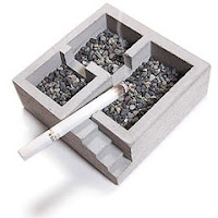
Kiso Ashtray/Desk Organizer

http://www.core77.com/blog/giftguide/kiso_ashtraydesk_organizer__11910.asp


We know, we know, you don't smoke! But if you did, you could smoke inside any room of this concrete structure--a rarity in these smoke-free times. (Great desk organizer if you've already kicked the habit.)

 When I looked at the picture, I thought it was only an ashtray. The Designer gives this product another function, desk organizer. I knew it when reading this article, then I stared to think I didn't really like it; however, after knowing its multi-functional purpose, this product was more interesting to me.

HP rises to Walmart Design Challenge with packaging-reducing idea

http://www.core77.com/blog/object_culture/hp_rises_to_walmart_design_challenge_with_packagingreducing_idea_11853.asp


As we do our shopping this holiday season, does it not seem a bit silly that we may buy electronics products that will come wrapped in cardboard, plastic and styrofoam, and then the recipient will throw that packaging away, and buy another product to hold the first product in? Not to mention that second product will also come wrapped in its own packaging.
We feel HP is on the right track with this rather brilliant idea--why not sell a laptop packaged in a laptop bag? Cardboard boxes and styrofoam, after all, are designed to protect their contents; so is a laptop bag, and it takes up a heckuva lot less space, meaning more will fit on a shipping pallet.
HP came up with the concept under Walmart's Design Challenge, which "asked electronics manufacturers to produce a product that would reduce environmental impact.... And the result was a winning solution that reduced packaging materials by 97%."
We know it's not practical to sell refrigerators inside of a 'fridge cozy, but for more portable items, if manufacturers can design cases that people actually want, we could be seeing the beginning of a very positive trend.


It is really a good idea. Hope I can buy every product without buying another protective bag in near future.

Wine about the environment

http://www.core77.com/blog/object_culture/wine_about_the_environment_12091.asp


We recently posted about HP's concept of shipping laptops in laptop bags, rather than just cardboard boxes; another packaging-life-extension concept we've seen is a wine bottle package that turns into a lamp.
Designed by Barcelona-based design firm Ciclus, the product isn't perfect--debate rages over whether this is better for the environment or worse--but we feel it's a step in the right direction.


It's also a good idea, but the expense of package is higher than normal paper package. Because of an extra bulb and wire, the package must charge more. I think the customers may not accept extra cost.

Japan: robot nation

http://www.core77.com/blog/technology/japan_robot_nation_12085.asp

http://current.com/items/89610631/japan_robot_nation.htm


Japan, the world's second largest economy, is facing a demographic crisis that will shrink the population dramatically. The Japanese aren't having babies, and the country won't accept immigrants to help bolster the population. But Japan may have a unique solution --- Robots!


This article let me think of "I-Robot." Our world could be replaced by machines one day. The population is getting lower and lower, and the senior people are more and more. Is it a crisis to human being?

Leather keyboard

http://chinese.engadget.com/2008/12/15/goguikawa-leather-keyboard/


The leather keyboard is on the market now, but I want a wooden keyboard. I think the wooden texture is more attractive.

Cellphone gun

http://chinese.engadget.com/2008/12/13/the-cellphone-gun-from-italy/


It was confiscated by Italian police from the Mafia.

Monday, December 1, 2008

TrueMotion Control

http://chinese.engadget.com/2008/11/30/truemotion-3d-enables-true-motion-control/


I don't have chance to play Wii, so it's harder for me to imagine playing this new interactive device. However, I can't wait to try it.

The public domain

http://www.core77.com/blog/book_reviews/the_public_domain_11868.asp


In The Public Domain: Enclosing the Commons of the Mind James Boyle introduces readers to the idea of the public domain and describes how it is being tragically eroded by our current copyright, patent, and trademark laws.
In a series of fascinating case studies, Boyle explains why gene sequences, basic business ideas and pairs of musical notes are now owned, why jazz might be illegal if it were invented today, why most of 20th century culture is legally unavailable to us, and why today's policies would probably have smothered the World Wide Web at its inception.
Appropriately given its theme, the book will be sold commercially but also made available online for free under a Creative Commons license.


After seeing this video, I feel so sad for the mother nature.

Jørn Utzon Dies


http://www.core77.com/blog/news/jrn_utzon_dies_11864.asp

Danish architect Jørn Utzon, designer of the Sydney Opera House, died today. He was 90. Taught by Alvar Aalto and declared a genius by none other than Eero Saarinen, Utzon designed one of the most recognizable structures on the planet.
Still, his name is uncommon, if not unknown. Utzon designed the opera house in 1957 at age 39, but outrageous cost overruns (it was 1,400% over budget) and skirmishes over the design made him quit the project in 1966. It was finished seven years later without him. He never returned to Australia.
The opera house's sail-like roof was supposedly inspired by Utzon peeling an orange; the curved slices fit into a perfect sphere. The house won Utzon the Pritzker Prize—architecture's highest honor—in 2003, proving, the jury declared, that "the marvelous and seemingly impossible in architecture can be achieved."


In the Spring of 2006, I went to Sydney for fun and visited Sydney Opera House. It's so terrible that I don't know who designed Sydney Opera House till now.

Sunday, November 23, 2008

Grace Hartigan, 86, Abstract Painter, Dies

http://www.nytimes.com/2008/11/18/arts/design/18hartigan.html


Grace Hartigan, a second-generation Abstract Expressionist whose gestural, intensely colored paintings often incorporated images drawn from popular culture, leading some critics to see in them prefigurings of Pop Art,
The cause was liver failure, said Julian Weissman, a longtime dealer of hers.
Ms. Hartigan, a friend and disciple of Jackson Pollock and Willem de Kooning, subscribed to the Abstract Expressionist notion of the painterly brushstroke as existential act and cri de coeur but, like de Kooning, she never broke entirely with the figurative tradition. Determined to stake out her own artistic ground, she turned outward from the interior world sanctified by the Abstract Expressionists and embraced the visual swirl of contemporary American life.
In “Grand Street Brides” (1954), one of several early paintings that attracted the immediate attention of critics and curators, she depicted bridal-shop window mannequins in a composition based on Goya’s “Royal Family.” Later paintings incorporated images taken from coloring books, film, traditional paintings, store windows and advertising, all in the service of art that one critic described as “tensely personal.”
“Her art was marked by a willingness to employ a variety of styles in a modernist idiom, to go back and forth from art-historical references to pop-culture references to autobiographical material,” said Robert Saltonstall Mattison, the author of “Grace Hartigan: A Painter’s World” (1990).
Grace Hartigan was born in Newark in 1922 and grew up in rural New Jersey, the oldest of four children. Unable to afford college, she married early and, in a flight of romantic fancy, she and her husband, Bob Jachens, struck out for Alaska to live as pioneers. They made it no farther than California, where, with her husband’s encouragement, she took up painting.
“I didn’t choose painting,” she later told an interviewer. “It chose me. I didn’t have any talent. I just had genius.”
In the mid-1940’s she left her husband, placed their son, Jeffrey, in the care of his parents and moved back to Newark, where she trained in mechanical drafting and took painting lessons with Isaac Lane Muse. After moving to the Lower East Side of Manhattan in 1945, she became part of the postwar New York artistic scene, forming alliances with the Abstract Expressionist painters — although de Kooning reduced her to tears by telling her she completely misunderstood modern art — and poets like Frank O’Hara, John Ashbery and Kenneth Koch.
Ms. Hartigan won fame early. In 1950, the critic Clement Greenberg and the art historian Meyer Schapiro included her in their “New Talent” show at the Kootz Gallery, and a one-woman exhibition at the Tibor de Nagy Gallery soon followed. “Persian Jacket,” an early painting, was bought for the Museum of Modern Art by Alfred Barr.
Barr and the Museum of Modern Art curator Dorothy Miller included her in two important shows, “12 Americans” in 1954 and “The New American Painting,” an exhibition that toured Europe in 1958 and 1959 and introduced Abstract Expressionism abroad. In 1958, Life magazine called her “the most celebrated of the young American women painters.”
After starting out as a purely abstract painter, Ms. Hartigan gradually introduced images into her work. It was O’Hara’s blending of high art and low art in his poetry that influenced her to cast far and wide for sources.
In 1949 she married the artist Harry Jackson, “not one of my more serious marriages,” she later said. The marriage was annulled after a year. In 1959 she married Robert Keene, a gallery owner, whom she divorced a year later. In 1960 she married Winston Price, an epidemiologist at Johns Hopkins University who collected modern art and had bought one of her paintings. After injecting himself with an experimental vaccine against encephalitis in 1969 and contracting spinal meningitis, he began a long descent into physical and mental illness that ended with his death in 1981.
Ms. Hartigan is survived by a brother, Arthur Hartigan of Huntington Beach, Calif.; a sister, Barbara Sesee of North Brunswick, N.J.; and three grandchildren. Her son, Jeffrey Jachens, died in 2006.
Ms. Hartigan’s move to Baltimore coincided with a drastic shift in artistic fashion, as Pop Art and Minimalism eclipsed Abstract Expressionism. Out of the spotlight, Ms. Hartigan embarked on what she later recalled as “an isolated creative life.” For decades she painted in a loft in a former department store and taught at the Maryland Institute College of Art. The college created a graduate school around her, the Hoffberger School of Painting, of which she became director in 1965. She taught at the school until retiring last year.
As historians and curators reassessed the history of postwar art, she experienced a resurgence of sorts. Her use of commercial imagery led her to be included in “Hand-Painted Pop,” a 1993 exhibition at the Whitney Museum, despite her loathing for the movement.
“Pop Art is not painting because painting must have content and emotion,” she said in the 1960’s. On the other hand, she reflected at the time of the Whitney show, “I’d much rather be a pioneer of a movement that I hate than the second generation of a movement that I love.”
Her work was exhibited as recently as May at the Jewish Museum in New York, in “Action/Abstraction: Pollock, de Kooning and American Art, 1940-1976.”
On an artistic path marked by twists and turns and restless experimentation, she maintained a fierce commitment to the modernist agenda and a belief in art’s near-magical powers.
“Now as before it is the vulgar and the vital and the possibility of its transformation into the beautiful which continues to challenge and fascinate me,” she told the reference work “World Artists: 1950-1980.”
“Or perhaps the subject of my art is like the definition of humor — emotional pain remembered in tranquillity.”


Before reading this article, I didn't who Grace Hartigan was. I only knew a few abstract painter such Jackson Pollock and De Kooning. Gradually, I know more American artists.
Compared her and Jackson Pollocks' painting, her painting is more difficult for me. No matter how I analyze her painting I still couldn't get into it. Maybe, I don't have good eyes for abstract painting.

Guess the X-ray

http://www.core77.com/blog/object_culture/guess_the_xray_11780.asp


Anyone know what this is?

Answer: a MacBook

I though that was a Pc. Even though I'm using MacBook right now, I didn't get the right answer. It's so inspiring because it provides a new view of ordinary things. I never think of other things in such special perspective. Perhaps, I just too get used to the things around me so that I don't really inspect them.

Lego Mindstorms NXT Safe

http://chinese.engadget.com/2008/11/23/lego-coffer/


Monday, November 17, 2008

styleframes

Oblong g-speak

http://chinese.engadget.com/2008/11/17/oblongs-g-speak-the-minority-report-os-brought-to-life/


g-speak overview 1828121108 from john underkoffler on Vimeo.

Soil Lamp

http://chinese.engadget.com/2008/11/17/soild-lamp-burns-leds-and/


This is a lamp that you can put in front of your house. Under the bottom of this device, it's soil with living organism. While those small creatures process metabolism, it generates the electricity lighting the lamp.

Packaging: Bad design begets more design

http://www.core77.com/blog/object_culture/packaging_bad_design_begets_more_design_11750.asp

While consumer companies were inflicting bad packaging upon us, a new category of tools developed to get the darn things open. These will probably remain on store shelves until the new wave of packaging emerges.

The Ultimate Package Opener has a short 2mm blade that extends and cuts into packaging when the button is pressed.


As a consumer, I will buy it><. I can't forget last time I was trying so hard to open a plastic packaging, and almost got hurt by its tick and sharp edge. It's really what I need.

Sunday, November 9, 2008

MacBook Nano Black!?

http://chinese.engadget.com/page/2/


I found this article in Chinese Engadget. A Taiwanese remodeled a laptop and called it Mac Book Nano. Not only did he made up a fake laptop, but also installed the mac software in that PC. The result looks so real. Besides, he also photoed the process of modification. It's very helpful because I'm going to make my own modular model.

More pictures at:
http://www.flickr.com/photos/mickpro/sets/72157608

Pure*Gold PC: for millionaires and Bond villians

http://www.musicradar.com/news/tech/puregold-pc-for-millionaires-and-bond-villians-179226
Recession? What recession?
Ben Rogerson, Thu 30 Oct, 11:27 am UTC


With the financial crisis starting to bite, conspicuous consumption probably isn't an option for most people at the moment.
However, if you are lucky enough to have some savings and you're nervous about keeping them in the still-wobbly banking system, why not throw them into the Pure*Gold PC?
We're not sure how much of the precious metal this most bling of computers actually contains, but with an Intel Core 2 Duo processor, it should at least be powerful enough to do some music on.
Also inside are a 100GB hard drive and 4GB of RAM, while connectivity options include eight USB 2.0 ports and two FireWire sockets.
No news on how much the Pure*Gold PC actually costs, but if you have to ask, then you probably can't afford it.


Gold PC? It's so ironic. The economic crisis is so serious now, and who will spent money on that? Even if I could afford it, I wouldn't buy it. After all, computer worths less year after year. Why not just buy gold? I don't think buying gold PC is a good investment.

Drape Table or Basket by Jane Punnopatham

http://www.core77.com/blog/object_culture/drape_table_or_basket_by_jane_punnopatham_11667.asp


When designers talk about their own work, we like to listen:
"Senior Designer, Jane Punnopatham, for the Spectrum West Collection was inspired by both blooming flowers, hanging drapery, and the whimsical lines of Alvar Alto's Wave Vase. Marc Ross, Creative Director for Spectrum West, and Jane Punnopatham desired to take their brand material, acrylic, that was once dubbed a cold material, and provide warmth with the free flowing lines of the Drape Side Table. Each Drape Table is heated and molded by hand ensuring that every table is individually different for the consumer. Available Fall colors include: Frost, Clear, and Charcoal."
We also just heard that Jane is in the hospital from a serious accident. We wish her the best & get well!


So cool. I was blowed away when seeing it. Its form is marvelous. On the other hand, the form and material is a big contrast. The form looks like a soft fabric, but it was made of acrylic, which is solid and hard. Before reading the article, I thought it was glass, heavy and fragile. No sooner I found that it was made of plastic, which is lighter and safer. That make more sense to me since it is also a basket.

Assignment #5

-Theme:
Domesticated Organism as a medical treatment.

-Tagline:
life-fix

-purpose/uses/service: 
1. Accelerating the metabolism.
2. Repairing the injury.
3. Improving the facial problems.

-treatment/scenario
1. A close up of a patient who is deformed by fire.
2. Few drops of domesticated organisms applying on the wound.
3. Gradually, the color of the skill changes to normal.
4. The condition of skill is even better than before. The wrinkles and the black cycles disappear.

Sunday, November 2, 2008

Stop Motion2

The World, Up Close


Started in 1974, the Nikon International Small World Competition is held annually to recognize excellence in photographs taken through a microscope. This year, there were more than 2,000 micrographs entered from around the world.


This picture catch my attention because the topic is related to my recent project of branding, micro organism as a medical treatment. It's almost impossible to photo them without the proper equipment. I could only imagine their forms and movement.
This image provides a very good idea of how those small creatures look like and their characters. I will use this image as a supplement of my project of stop motion video.

1 Hour Design Challenge: Sick-Ass Car Rendering Winners!

http://www.core77.com/blog/featured_items/1_hour_design_challenge_sickass_car_rendering_winners_11298.asp


First Place


Judge's Comments: I am a sucker for loose empathic sketches. This artist has a naturally loose style that very effectively captures the aggressive personality of the car. I saw the sketch before I saw the video and was surprised to see it wasn't an electronic sketch. Many designers I come across try hard to capture this loose feel in electronic mediums as it seems to give design much more soul. This artist's multi media style, while totally fresh in design, it is a little old school in technique. A great combination, with a delicious fine art flare as he uses generous amounts of pastel and markers that give the sketch a great deal of depth. I like the spontaneous feel of this sketch, it is tightened up just enough with some very descriptive shading and deep saturated grey tones. All complimented by succinct line work around the headlamps and grill, much the same way a fine artist does portraits...the personality is captured in the eyes and facial features. I like the very efficient use of line work, and the paper showing through does the rest in leaving just enough to the imagination, like a good rendering should. Very cool.

Second Place: Paul Kirley


Judge's Comments: Great technique and hard to believe it was done on a tablet! I am obviously a sucker for Mopars, so it was difficult not to be a little biased here as the design is clearly influenced by a 69-70 Charger. The dramatic contrast has the car in an improbably dusk and high noon combo. This plays mind games on the viewer, as the light source seems to be coming from the same side of the car that is in total shadow. Nevertheless, the end result is very dramatic and the artist made some great choices in the use of some very beautiful colors.


I think the judge was unfair. Although the First Place used hand drawing technic and remained strokes as strong personal character, it doesn't mean that the result is good. Personally speaking, the Second Place is more complete than the First Place. The rendering of the First Place is too rough. After all it's not a fine art painting competition.

USB Authenticated Deadbolt Lock

http://hackaday.com/2008/10/22/usb-authenticated-deadbolt-lock/


What if I lost my USB? I think I would prefer to have a substantial key for my door of the lock XD. However, for a point, it's a creative and new idea that I would never think of.

Monday, October 27, 2008

Video

DesignPhiladelphia 2008: Student Work at 222 Gallery

href="http://www.core77.com/blog/images/book%20table.jpg">

href="http://www.core77.com/blog/images/222gallery%20show.jpg"><


Last week marked the end of DesignPhiladelphia, but Gallery 222 is keeping Product 01 and Build 02, two exhibitions of work from two of Philadelphia's premiere design education courses, running through November 1st.
Checkout some of the highlights after the jump.
UNIVERSITY OF PENNSYLVANIA / SCHOOL OF DESIGN Product 01
Product 01 presents output from the product design course in the University of Pennsylvania's Integrated Product Design concentration from Spring of 2008. The course, taught by Josh Owen and assisted by Bryce Gibson, was designed to explore intersections of functionality and performance using an experimental platform to rediscover opportunities within the built environment to create domestic products.

PHILADELPHIA UNIVERSITY / INDUSTRIAL DESIGN PROGRAM + WILSONART Build 02
Build 02 presents a portion of the output from sophomore industrial design studio at Philadelphia University from Spring of 2008. The course, taught by Josh Owen and Jason Lempieri, was a collaboration with Wilsonart Inc. where students were challenged to develop full-scale seating devices which explored and celebrated Wilsonart's laminate material. This exhibition reveals the process and many of the final products. Several selected projects from this course will not be on view at this exhibit but will be shown at the International Contemporary Furniture Fair in New York City in May of 2009.


I'm also working on product design for homework. Naturally, I started look at those pictures.
"Sole Mate", for me, is not practical. I think the food print problem still needs to be fixed. Otherwise, it can just be a display holder showing the product in the store.
"Book Table" is my favorite. It reminds me of difficulty when reading a big books or magazines, and they cannot match the surface of the table. That is really annoying; especially, I want to underline some words.

Sunday, October 26, 2008

The Big Picture

http://www.nytimes.com/2008/10/19/magazine/19style-t.html?ref=design

While you may have never heard of him, Hervé Descottes has perhaps had as large an impact on the contemporary New York skyline as any architect working today. The principal lighting designer and president of L’Observatoire International, Descottes has been charged with illuminating major landmark sites around the city from Columbus Circle to the newly renovated High Line.


“Lighting can have an incredible visible or invisible power,” says Descottes, one of whose first projects as a lighting designer, back in 1991, was to light the Mona Lisa after it was reinstalled in the Louvre. Here, he is testing his handiwork at the New York City Department of Environmental Protection’s Newtown Creek Wastewater Treatment Plant in Brooklyn, which was designed by Greeley and Hansen, Hazen and Sawyer and Malcolm Pirnie, in association with Polshek Partnership Architects, and will include a sculptural visitors’ center by the artist Vito Acconci and a waterfront nature walk by George Trakas. It is a project that began more than a decade ago and will probably be finished sometime around 2015. The plant, with its 50-plus-acre site and eight massive sludge tanks operating 24/7, was hardly a subtle addition to the urban landscape (glowing right next to the Queens-Midtown Tunnel); the challenge, for the architects and also for Descottes, was to remain sensitive to the surrounding residential neighborhood. In other words, Descottes says, “we didn’t want it to look like a refinery.” This is usually the kind of industrial institution that requires only functional lighting, says Descottes, who ultimately enveloped the site in a veil of blue light. (Blue, he explains, has a sense of purity and cleanness.) L’Observatoire works on some 25 projects all over the world at any given moment — from Frank Gerhy’s Louis Vuitton Foundation, under construction in the Bois de Boulogne, to a residential building to be built in Kuala Lumpur by Jean Nouvel. Still, the wastewater plant, he insists, is definitely one of the most glamorous. “Sometimes it doesn’t smell so good,” he says. “But at least it doesn’t look so bad.”


What? lightening designer! I've never known about this occupation. I thought it was belonged to interior designer. In this country, people only need to know something specific to make a living, so that each person can just focus on one small area and make it better. Unfortunately, in my country, people have to do many things in order to be haired.

Art and Commerce Canoodling in Central Park

http://www.nytimes.com/2008/10/21/arts/design/21zaha.html?ref=design


The wild, delirious ride that architecture has been on for the last decade looks as if it’s finally coming to an end. And after a visit to the Chanel Pavilion that opened Monday in Central Park, you may think it hasn’t come soon enough.
Designed to display artworks that were inspired by Chanel’s 2.55, a quilted chain-strap handbag, the pavilion certainly oozes glamour. Its mysterious nautiluslike form, which can be easily dismantled and shipped to the next city on its global tour, reflects the keen architectural intelligence we have come to expect from its creator, Zaha Hadid, the Iraqi-born architect who lives in London.
Yet if devoting so much intellectual effort to such a dubious undertaking might have seemed indulgent a year ago, today it looks delusional.
It’s not just that New York and much of the rest of the world are preoccupied by economic turmoil, although the timing could hardly be worse. It’s that the pavilion sets out to drape an aura of refinement over a cynical marketing gimmick. Surveying its self-important exhibits, you can’t help but hope that the era of exploiting the so-called intersection of architecture, art and fashion is finally over.
The pavilion, made of hundreds of molded fiberglass panels mounted on a skeletal steel frame, was first shown in Hong Kong in February. From there it was packed up in 55 sea containers and shipped to Tokyo, closing there in July and heading to New York, where it will be on view through Nov. 9. Chanel is paying a $400,000 fee to rent space in the park and has made a gift of an undisclosed amount to the Central Park Conservancy as part of the deal.
The company’s money couldn’t have bought a prettier site. The pavilion stands on Rumsey Playfield, near Fifth Avenue and 69th Street, on a low brick plinth at the edge of the park’s concert grounds. Groves of elm and linden trees frame the pavilion to the north and south; a long trellis draped in wisteria flanks it to the west, with the Naumburg Bandshell rising immediately behind it. The area is carpeted in colorful fall leaves.
Visitors arrive at the site along a low brick staircase where Chanel employees collect their tickets. (The tickets are free but must be reserved in advance on the Internet.) When you reach the top of the staircase, the pavilion’s white shell seems suddenly to peel open, as if to lure you inside. A broad ramp and a few shallow steps lead up to a small terrace. The long, curved form of the ticket booth frames the terrace’s outer edge, its tail-like shape stretching back to envelop the composition as if it were an embracing arm.
As with all of Ms. Hadid’s best work, the forms are not just decorative but also direct the pattern of movement through the site, collecting the energy surrounding it and channeling it into the building. Visitors enter one at a time, catching a brief glimpse of the interior before emerging into a narrow lobby. A guide instructs you to sit down and fits you with an MP3 player. The husky voice of the French actress Jeanne Moreau then invites you to stand up, before guiding you through your “personal journey.”
A series of curvaceous forms, finished in a pearlescent white car paint, are used to break down the pavilion’s interior into discrete galleries without interrupting the sense of flow. A staircase leads up to a small balcony, where you can gaze back down into one of the galleries and orient yourself. (Most of the artwork, which includes a life-size S-and-M teddy bear and scenes of a Japanese model tied up in gold chains, is completely mundane: tame clichés laboring to be provocative.)
Eventually you spiral around to an interior courtyard that serves as the pavilion’s social heart. Light pours down through skylights made of soft, pillowy panels, illuminating a gigantic reproduction of a quilted Chanel handbag tipped on its side.
The sequence of spaces is masterly choreographed. The flow of movement slows at certain points, only to speed up again before thrusting you back outside. The design’s structural refinement also reflects a high level of control. Although the building’s steel ribs vary in size, they all radiate from a central point, so that you sense an underlying order in the form. The pavilion has the taut, finely crafted look of a luxury sports car, a winking echo of Modernism’s centurylong obsession with the assembly line.
It’s not that hard to see why Ms. Hadid accepted the commission. One of architecture’s most magical aspects is the range of subjects it allows you to engage, from the complex social relationships embodied in a single-family house to the intense communal focus of a concert hall. Great talents want to explore them all; it is what allows them to flex their intellectual muscles.
But traumatic events have a way of making you see things more clearly. When Rem Koolhaas’s Prada shop opened in SoHo three months after the World Trade Center attacks, it was immediately lampooned as a symbol of the fashion world’s clueless self-absorption. The shop was dominated by a swooping stage that was conceived as a great communal theater, a kind of melding of shopping and civic life. Instead, it conjured Champagne-swilling fashionistas parading across a stage, oblivious to the suffering around them.
The Chanel Pavilion may be less convoluted in its aims, but its message is no less noxious. When I first heard about it, I thought of the scene in the 1945 film “Mildred Pierce” when the parasitic playboy Monte Beragon sneeringly tells the Joan Crawford character, a waitress toiling to give her spoiled daughter a better life, that no matter how hard she scrubs, she will never be able to remove the smell of grease. We have been living in an age of Montes for more than a decade now. For strivers aching to separate themselves from the masses, the mix of architecture, art and fashion has had a nearly irresistible pull, promising a veneer of cultural sophistication.
Opening the pavilion in Central Park only aggravates the wince factor. Frederick Law Olmsted planned the park as a great democratic experiment, an immense social mixing place as well as an instrument of psychological healing for the weary. The Chanel project reminds us how far we have traveled from those ideals by dismantling the boundary between the civic realm and corporate interests.
The pavilion’s coiled form, in which visitors spiral ever deeper into a black hole of bad art and superficial temptations, straying farther and farther from the real world outside, is an elaborate mousetrap for consumers. The effortless flow between one space and the next, which in earlier projects suggested a desire to break down unwanted barriers, here suggests a surrender of individual will. Even the surfaces seem overly sleek by Ms. Hadid’s normal standards; they lack the occasional raw-material touch common to her best buildings, which imbued them with a human dimension.
One would hope that our economic crisis leads us to a new level of introspection and that architects will feel compelled to devote their talents to more worthwhile — dare I say idealistic? — causes.


This article attracted my attention because one of my friend mentioned about this exhibition before. She said I had to inquire ticket on the internet before going, and then I was wondering what kind of exhibition it would be. After reading it, still, I'm not interested in seeing it. Is it because I'm influenced by the author of this article or I just don't want to go. I think both.

Sunday, October 19, 2008

William Claxton, Photographer, Is Dead at 80

http://www.nytimes.com/2008/10/14/arts/design/14claxton.html?_r=1&scp=1&sq=william%20claxton,%20photography,%20is%20dead%20at%2080&st=cse&oref=slogin


"......Herman Leonard, another pre-eminent jazz photographer, said in a telephone interview on Monday: “When we started out, there were hardly any other photographers doing this kind of thing because there was no money in it. We started doing it because of the love of photography and the love of jazz.”


Even though I had taken photography in the college, I still have no cure who Claxton is. Stieglitz and Ansel Adams are two of memorable photographers for me. Then I stared to google his works on the internet.
After quickly reviewing Claxton's photography, I only can find two photos which I like.

MacBook production methods video

https://www.core77.com/blog/default.asp?p=3


Okay, we promise this is the last you'll hear of it; but for Apple to post a video featuring two of their industrial designers showing factory footage of different production methods is just too industry-specific for us not to post about. Extrusions, milling, laser-machining, all for that little laptop. Heck, we get more pleasure from watching the thing being built than we do from laying our eyeballs on the finished product.


The new Macpro is what I'm waiting for. Since I was told Mac was going to have a new version of Macpro, I didn't buy it during the summer. It was really a gamble because the summer promotion was end. Fortunately, the newest version doesn't let me down. But I wonder is the new trakpad working well when removing the two buttons. I have better tried it in the store.

ReMake Its - DIY recycling kits

http://www.core77.com/blog/object_culture/remake_its_diy_recycling_kits_11471.asp


In the world of reused object design, Tiffany Threadgould is a breath of fresh air. Her current lineup of DIY recycling kits are poised perfectly for the upcoming holiday season, and if you can get past the paradox of buying something more in the service of recycling something already in existence, well, then ReMake its kits are for you. We smile at the Wine Cork Trivet, but swoon for the Magazine Stationery.
These kits and more at her site: www.replayground.com


When I have opportunity to create a product, I only think about designing something new. However, there are many ways of designing a new product. She didn't follow the same path; Tiffany didn't try to persuade people to buy her product. Her designs is what customers need. The concept of those products are very innovative.

Wednesday, October 15, 2008

Sunday, October 12, 2008

Van Gogh at the Modern

http://www.nytimes.com/slideshow/2008/09/19/arts/0919-GOGH_index.html


The Museum of Modern Art’s exhibit, “Van Gogh and the Colors of the Night,” includes “Starry Night” and “The Potato Eaters.”


Van Gogh and the Colors of the Night
September 21, 2008–January 5, 2009
Special Exhibitions Gallery, second floor
http://www.moma.org/exhibitions/2008/vangoghnight/


"Starry Night over the Rhone,1888," is one of my favorite Van Gogh's paintings. In this painting, my favorite part is how he portrayed the lights reflecting on the surface of the river. Van Gogh left several firm and short strokes in yellow with lite orange. The reflections look glamorous and attractive. I have one copy, but It looks dull, and size is small. When I saw the real piece, I was astonished. Its color is much more rich and saturate. He applied many different blue colors, light blue, iron blue, gray blue...etc. The smooth blue gradation creates a consistent clear sky. In this painting, the stars are twinkling, and the light reflections are glittery. This painting remind me of being alone in the midnight, a feeling of peace and quiet.
Stepmothers of Invention: Branding Firms Enter the Industrial Design Fray, by Carl Alviani

http://www.core77.com/blog/featured_items/stepmothers_of_invention_branding_firms_enter_the_industrial_design_fray_by_carl_alviani_11273.asp


"..........a lot of product designers have made their careers by getting in on the branding game in the past couple of decades. It shouldn't come as any surprise to hear that the same thing is starting to happen in reverse--branding agencies are doing product, and they're doing it fairly well.
Should product designers feel threatened? Depends on who you ask.......「Product is the ultimate communication tool," Winsor explained, "To me, branding and ID are different sides of the same coin. We're both satisfying the needs of the customer.」.........."


Today, customer purchases products considering not only the function, but the abstract values. They buy certain goods to satisfy their need; moreover, they transfer the extra values on themselves. When customer become richer, they are no longer bind for the price. In this way, branding will be come the major part of product design industry. Personally, I think product designers should get involved with branding if they don't want to be eliminated from the competitive market.

Artist in Residence, Sort of, at the Whitney

http://www.nytimes.com/2008/10/03/arts/design/03voge.html?scp=1&sq=Artist%20in%20Residence,%20Sort%20of,%20at%20the%20Whitney&st=cse


Some artists are happy enough just having their work shown at the Whitney Museum of American Art, but 37-year-old Corin Hewitt is actually moving in.
For three months starting Friday, visitors will be able to observe him working every Friday, Saturday and Sunday in the small gallery just off the Whitney’s lobby. There he has created his own universe, an environment that is part kitchen, part office, part garage and part garden.
In a blend of photography and performance and installation art, Mr. Hewitt will construct objects, compose still lifes and take photographs of his creations. As the project, called “Seed Stage,” unfolds, each of the photographs will be framed and hung on the gallery walls surrounding the environment.
Strewn around the space is everything from a hot plate, freezer and microwave oven to a paper shredder, pressure cooker, camera and water-filtration system. There is a custom-built worm composting system, a crawl space, trapdoors and a root cellar filled with vegetables that he grew this year in Vermont, where he spends his summers.
“We’re always looking for interesting ways of enlivening our lobby,” said Tina Kukielski, a senior curatorial assistant at the Whitney who organized the project.
Installing the environment was a 10-day undertaking. Mr. Hewitt described the space as something “between a studio and a still life in motion.”
He enjoys fashioning objects from unusual materials. He weaves baskets from pasta, for example, and paints spinach red before torching it and then photographing it.
Ms. Kukielski predicts that by the time Mr. Hewitt wraps up his project on Jan. 4, about 70 of his photographs will be hanging on the walls. “It’s an examination of the cycles of transformation and transience,” she said of the project.

Corin Hewitt: Seed Stage 
on view October 3, 2008 - January 4, 2009
 
http://whitney.org/www/exhibition/hewitt.jsp

CORIN HEWITT
Born 1971
Lives and works in Brooklyn, NY
Education
1996 Staatliche Akademie der Bildenden Kunste, Karlsruhe, Germany
1993 B.A., Oberlin College, OH


It's really a new way of presenting artist work, including the process. The museum set up a studio in the lobby, and the audience can peer at the artist while he is doing his work. I think that must satisfy some curiosities about how artist proceeds their job.

Sunday, October 5, 2008

Closer to Mainstream, Still a Bit Rebellious

http://www.nytimes.com/2008/10/02/arts/design/02fair.html?ref=design


Being called a sellout can hurt. Still, he’s not bitter. “I hated being under anyone’s thumb when I was younger and now I’m not, through my art,” he said in an earlier interview at the Obey headquarters in the Echo Park section of Los Angeles. As he signed 450 of his Billy Idol posters, he added, “This ability to make things creatively on my own terms that then found an audience and sold — I’ve sort of made my dream come true.”


I feel that we love some artist's works which are rare or small amount . Once they are accepted by most of people, we discard then. We ten to show our differences or uniqueness by using all kind of methods: clothe, images, music, movies. We tell people what we like and what we appreciate. Those things are mostly rare in order to express our prominent taste. But, sometimes, I wonder we may just want to differentiate ourself from other, so that we don't go with the mainstream.

Does Nokia's "Tube" have what it takes? And why do people buy what they buy?

http://www.core77.com/blog/object_culture/does_nokias_tube_have_what_it_takes_and_why_do_people_buy_what_they_buy_11330.asp


We have to disagree with PC World's recent article, "Why Nokia's 'Tube' Is the iPhone's Biggest Threat," purporting that Nokia's 5800 will provide close competition to the iPhone. And our stance does not come from some blind reverence for Apple; we're talking about a basic understanding product designers should all have--the importance of emotion when it comes to people, objects, and purchasing decisions.
The article points out that the $390 price tag of the Nokia is okay because it's simfree. They also say the phone
...will feature the Nokia's Comes with Music bundle, which will allow users to freely download an unlimited number of songs from Nokia's Music Store over a year after the initial purchase.
...Nokia's 5800 Express Music also features a 3.2-megapixel camera, with autofocus Carl Zeiss optics and a dual LED flash. All these blow iPhone's 2006 style 2-megapixel-no flash camera out of the water. Also, Tube records videos at VGA quality (640X480px) and has a frontal camera for video calls, something that the iPhone can't do at all. In this category, it's clear who's the winner.

Really, it's not. No one buys the iPhone for the camera. And are there a lot of bands people like on the Nokia Music Store?
The Apple hype did help Apple to sell millions of iPhones, but Nokia sells over 500 million devices every year, out of which almost 100 million are smartphones. If we take in consideration brand loyalty and the other advantages Tube has over iPhone, we're about to see a very tight competition between the two.
We disagree. People like the iPhone because it's easy to use, simple, and for better or worse, it's considered "cool." People ditched brand loyalty to get their hands on the iPhone, and the insane store lines proved it. The Nokia may have better features, but when it sees wide release and the two phones really go head-to-head in the marketplace, I think we'll all have an opportunity to learn something about product design.
Two more things: 1) Let's pick this conversation up again in a few months, when sales figures start coming out, and 2) right now, what do you guys think?


I think Nokia can't win. Apple manages their brand image so successful. People buy Apple's products are not for its superb functions, is because its trendy design and the social value. People built up their self-images by using them. In Taiwan, people buy Apple's products just like people buy luxury goods in the United States. They show off what they have got. One of my friend complained about inconvenience of operating I-tune; however, he still bought another Apple's products. Nokia should reinforce their brand image if they want to compete with Apple.

The Big Picture

http://www.nytimes.com/2008/09/28/magazine/28Style-t.html?ref=design

The same week that scientists at the CERN laboratory outside Geneva were getting ready to fire up the Large Hadron Collider, the artist Josiah McElheny was conducting a test of his own ideas on the Big Bang theory at Andrea Rosen Gallery in New York City. Inspired by the Lobmeyr chandeliers at the Metropolitan Opera House and informed by logarithmic equations devised by the cosmologist David H. Weinberg, McElheny’s chrome, glass and electric-light sculpture “The End of the Dark Ages” is part of a four-year investigation into the origins of the universe. What began with “The End to Modernity,” a sculpture commissioned by the Wexner Center for the Arts at Ohio State University, will culminate next month in a massive installation titled “Island Universe” at White Cube in London. “I had this quixotic idea to do modernized versions of the Lobmeyr chandeliers as sculpture with secret information behind it,” says McElheny, who upon first encountering these “gilded age/space age” objects immediately thought they looked like pop renditions of the Big Bang.
According to McElheny, physicists continue to struggle with the question “is the world this way because it must be, or is it just random?” In 1965, the year that the Lobmeyr chandeliers were designed, it was suddenly evident that our world is not in fact the center of the universe. This idea that there could be an infinite number of possible narratives was becoming popular not just in science but also in literature and art — so why not in interior design, too? As it turns out, Wallace K. Harrison, the architect for the Met, having rejected the original design for the chandeliers, gave Hans Harald Rath of Lobmeyr, the Vienna-based glassmaker, a book about galaxies and sent him back to the drawing board.
“The End of the Dark Ages” is a scientifically accurate model: the shortest rod represents 100 million years, the longest about 1.3 billion; the clusters of glass stand for galaxy formations, the lights for quasars. Still, McElheny is less concerned with the conceits of exact science than the limits of reason and knowledge. (The White Cube show proposes a “multiverse” and “speaks to what Kant describes so well as an endless world made of imperfection, complication and specificity.”) “Politically, I’m against finding the single answer,” McElheny insists. “I’m more interested in what these questions mean to our sense of who we are.


Art and Science? Searching for the truth is too serious. I don't really enjoy the work which connect to rational reasons. Can't it be more relaxing. Let simple thoughts dominate.

Sunday, September 28, 2008

I Love NY 3D Poster by Oded Ezer

http://www.core77.com/blog/object_culture/i_love_ny_3d_poster_by_oded_ezer_11272.asp#more


"Typographic artist Oded Ezer's I ♥ NY poster uses a 3D sculptural technique he developed in an earlier work called The Finger.
"This 70x100 cm poster is a homage to Milton Glaser, whose famous I ♥ NY logo is one of the things that stuck into my mind forever. Glaser's design is simple and direct, and I felt it will be still recognizable even if I will make it more complicated"
Based in Israel, Ezer made a conscious decision to produce more work in English after his presentation at TYPO Berlin when he noticed the audience's enthusiasm for the single piece he showed in English, the rest of his work was in Hebrew and only understandable by a few people."


Typographer is a new term for me. I thought it's more related to two dimensional forms than three dimension. Oded Ezer blew me away. In his work, the letters are sticked in different hight. When the light projects on those 3 dimensional letters, the shadows become a part of composition. It's complex and intriguing.

New Face, Renewed Mission

http://www.nytimes.com/2008/09/26/arts/design/26desi.html?ref=design


"The passionate battle fought recently over the redesign of 2 Columbus Circle, the curious white marble structure built by Huntington Hartford to house his art collection, was reminiscent of the preservation wars of the 1960s.

Now, with the opening this weekend of the newly renovated building as the Museum of Arts and Design, the public will finally be able to judge for itself whether it was a sin to disfigure the 1964 original.
Already a few things are blazingly clear. Designed by Brad Cloepfil of Allied Works Architecture, the renovation remedies the annoying functional defects that had plagued the building for decades. But this is not the bold architectural statement that might have justified the destruction of an important piece of New York history. Poorly detailed and lacking in confidence, the project is a victory only for people who favor the safe and inoffensive and have always been squeamish about the frictions that give this city its vitality........

.......Sadly, the Museum of Arts and Design will only reinforce the suspicion that city officials are more intent on sanitizing the city for jittery tourists and business interests than safeguarding the public realm.......

............The disappointments continue inside, where Mr. Cloepfil demonstrates his practical skills, but none of the virtuosity — a feel for materials and structure, for the play of light across surfaces — that can elevate a design from mundane concerns into the lofty realm of art.
"


For me, this new building looks great. It's much more better than the original. The writer was too skeptical. I'm not convinced by his/her reasons.
Using English letters H and E as exterior decoration reminds me of Typography. It's a great coherent since it is also a design museum.

A Building That Blooms and Grows, Balancing Nature and Civilization

http://www.nytimes.com/2008/09/24/arts/design/24acad.html?ref=design


"....The idea is to create a balance between public and private, inside and out, the Cartesian order of the mind and the unruly world of nature......
....Mr. Piano’s vision avoids arrogance. The ethereality of the academy’s structure suggests a form of reparations for the great harm humans have done to the natural world. It is best to tread lightly in moving forward, he seems to say. This is not a way of avoiding hard truths; he means to shake us out of our indolence."


This architecture is so interesting. The roof looks like a farm scattering with giant soda caps. Several bulges are covered by vegetation. That makes its appearance look natural and modern. It's a contradict combination.

Theme:Domesticated organism could apply on human body as medical treatment.


Shirly's

From: weishiou, 21 minutes ago


Shirly's
View SlideShare presentation or Upload your own.


SlideShare Link

Theme

"Your bathroom cabinet is full of unguents, greases, and perfumes. There are some pills in there, but most of them do not contain drugs. Instead, they contain living, domesticated organisms that make drugs while living inside you. Some of the "pills" are cameras, with tiny sensors and onboard processing. Nothing in your medicine cabinet is sterile, not even the bandages. Modern bandages contain living organisms that are good for wounds."


Theme
Domesticated organism will apply on human body as a treatment.

Monday, September 22, 2008

The New School Appoints Bruce Nussbaum Professor of Innovation And Design

http://www.businessweek.com/innovate/NussbaumOnDesign/archives/2008/09/the_new_school.html


"I’ve always wanted to live an “interesting life” and the journey has taken me to fascinating places. So I’m changing titles. For the next year and perhaps beyond, I’ll be at The New School, working with President Bob Kerrey (yes, the Senator), provost Joe Westphal, Parson’s dean Tim Marshall and a group of terrific professors and wonderful students from around the world, designing new programs, learning experiences, and research projects."

~Bruce Nussbaum


Since I coincidentally past by the New School(http://www.newschool.edu/) several times, I had a doubt in my mind. Is it another new school in this city? I have not idea about it at all. Maybe, it is just a whole new school without much experiences. After I reading this articles, I knew a little more about the New School. It's not totally a new school. In fact, it was composed by some schools. It also includes various students whose major are in drama, music, environment, design, and management. Moreover, the New School recruited Bruce Nussbaum, a contributing editor for innovation in Businessweek, as an visiting professor. This school is really a brilliant component. It takes advantages from several schools to turn into a new school. It can be many unites or a whole.

Real Work, by Mark Moskovitz


"have lost a meaningful connection to genuine exertion in their daily routine."


"This shift has drained the integrity from our exercise resulting in the simulation based gym phenomenon. The noble desire to eschew idleness has ironically created a machine that goes nowhere and does nothing; on but idling--humming to the arrhythmic tune of isolated beats in isolated headphones. Exercise does have a significant intrinsic value, but we've reinvented, re-valued, and recently re-wired it (think Wii) not as a by-product of an honest gesture, but as a simulation based currency. In the process, we're losing the concrete skills associated with that labor that fulfills our spirit and beautifies our surroundings."

~Mark Moskovitz


It's not really a serious problem for me be in New York City. Some of the American may need to work out in gym to I do a lot of labor action every day: walk, carrying heavy things. In my whole life, I have never walked so much. In Tiawan, almost every family has at least one scooter. I used to ride scooter everyday. No matter where I went I rode my scooter. Since I came to New York City, I have to even wash my clothe by hand. It couldn't happened on me.

Dupli.Casa by J. Mayer H.

http://www.core77.com/blog/object_culture/duplicasa_by_j_mayer_h_11186.asp


Core friends Archinect have launched a new feature called 'ShowCase' and to kick things off, they've started with Dupli.Casa located in Ludwigsburg, Germany by Jürgen Mayer H. Completed 2006-07, the villa is based on the footprint of the house that was originally built on the site in 1984.
The spatial configuration of the villa performs a sophisticated connection between inside and outside and offers spectacular views onto the old town of Marbach and the German national literature archive on the other side of the Neckar valley. The overall envelope is a smooth skin from roof to ground that avoids detailing by homogeneous transitions.


TAIPEI FIN ART MUSEUM
http://www.tfam.museum/

This architecture reminds me of Taipei Fine Art Museum. They have some similarities, such as, big square windows, white appearances, and cubic shape. It is really a coincident. Even though they are quite similar, they are very different in details.

Monday, September 15, 2008

Tomorrow Now: envisioning the next fifty years

Tomorrow Now: envisioning the next fifty years

(Page71-79)

""With "ubiquitous computing," the world becomes your darling! Bits seduce and juicily mingle with atoms! The cold clay twitches, opens camera eyes and microphone ears! What was once a distant, glassy "interface" becomes a hands-on, fleshy, sexy "interaction"…….

……More to the point, since it's networked, it is a relationship machine. My beloved wife and I boast a relationship that has gloriously outlasted whole generations of computers. She is by no means a corny "computer window." We both web surf constantly, and we send each other supportive, helpful, spousely e-mail through the Internet –even though we and our dual computers are in the same house.""


Computing is everywhere. People use it to deal with their relationship. It has become a representative of their lovers.

Sunday, September 14, 2008

At the Court of the Sun King, Some All-American Art

http://www.nytimes.com/2008/09/11/arts/design/11koon.html?pagewanted=1&_r=1

“I paid to see all of Versailles,” said Sylvie Guérin, an administrative technician from Montreal. “I didn’t come here to see a red lobster that I can buy in a gas station in Quebec to go in my pool.”


Koons's work are conceptual. They aren't easy to approach comparing with Europe paintings. Putting them in Versailles isn't really a good idea. His work is great in some aspect; however, they don't much the style of the building. There is no doubt that visitors don't appreciate them. It's just like you went to a coffee shop but only serve tea. The curator shouldn't have blurred the attraction of Versailles.

LIGHTS IN NEW YORK ...

http://www.nytimes.com/2008/09/05/arts/design/05voge.html?_r=1&scp=1&sq=moma%20acquires%20a%20rare%20braque%20&st=cse

"..........Starting Sept. 26 the facade of the Solomon R. Guggenheim Museum’s Frank Lloyd Wright building will be illuminated every Friday at dusk with words. They will range from comments about terrorism and the Iraq war to poems about loss, grief and love.

To honor the completion of the Guggenheim’s three-year restoration and the project’s biggest benefactor, the Cleveland philanthropist Peter B. Lewis, the museum commissioned the conceptual artist Jenny Holzer to create the site-specific illuminations.

On Sept. 22 at about 6:45 p.m. Mayor Michael R. Bloomberg will switch on the illumination in a prequel to the weekly viewing. After that it will be shown from sunset to 11 p.m. through December, with a special showing on New Year’s Eve, which falls on a Wednesday this year........"

Two years ago, it was my first time to New York City. I went to Guggenheim museum. Because it is one of the most famous architectures in New York City, I put it into my schedule. It was a pity that the museum was under construction. The museum looked like a construction site. There was no aesthetic beauty at all. I never thought I could have another chance to visit it again. Now the restoration is complete. I'm excited and can't wait to attend worship: seeing Wright's design and Holzer's illuminations.

As literal as liquid light gets

http://www.core77.com/blog/object_culture/as_literal_as_liquid_light_gets_11075.asp#more


"My aim is to look at all the resources we have and then try to redesign new future scenarios, rather than "redesign" what's already just to make it perform better. In this case, I was curious about the fact that domestic lighting has not changed, essentially, that much since Edison's invention: you always need a power source and a physical device (call it lightbulb, fiberoptic, led). What I wanted to do is to give a total different approach to light, make people realise we can think of objects that surround us different and shape the technological advance a different way." stated by Cristina Ferraz Rigo.


Liquid light is really a amazing idea. Although Cristina Ferraz Rigo used chemoluminescent reactions, which isn't a recent discover, her liquid light did inspire me. For some people, it is not a difficult design or great invention, just putting glowing liquid into a glass bottle, but who can think of this. Rigo blew my imagination away, but provided me a creative thought. It could be one way to start my own project:" try to redesign new future scenarios, rather than "redesign" what's already just to make it perform better."

Blog Archive